//Brand design - Copywriting - Motion - Strategy - Consultancy
Studio Scotto Rosato
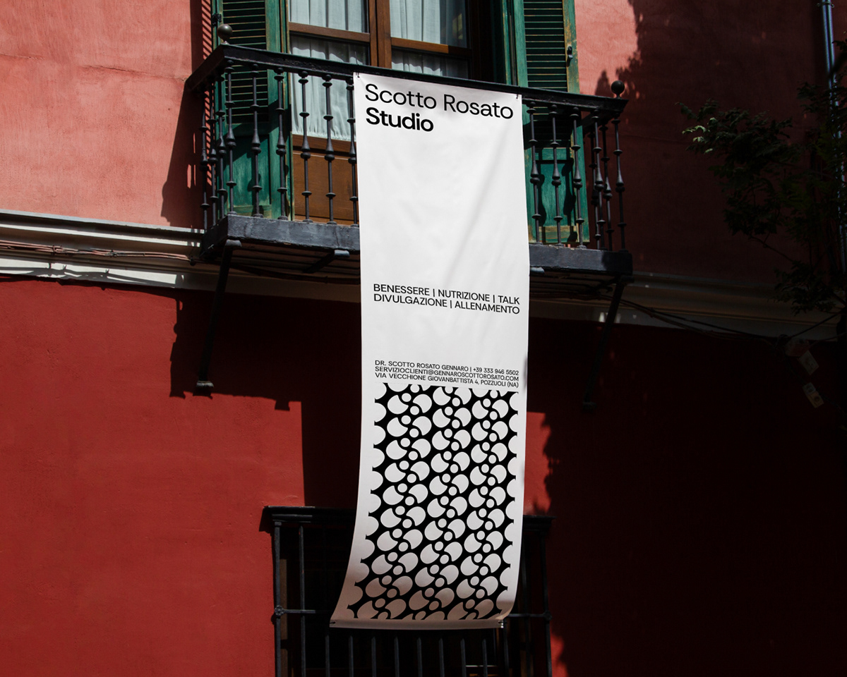
Studio Scotto Rosato is a multidisciplinary practice made up of professionals from various areas of personal care. Started as a small nutrition practice, since last September we have been working on how to expand and communicate our service offerings in order to be able to reserve for patients a path that can lead them to their goals in the most comprehensive way possible: from nutrition, to training, to psychological and osteopathic consultation.
Design: Umberto De Cristofaro
2024


Logo
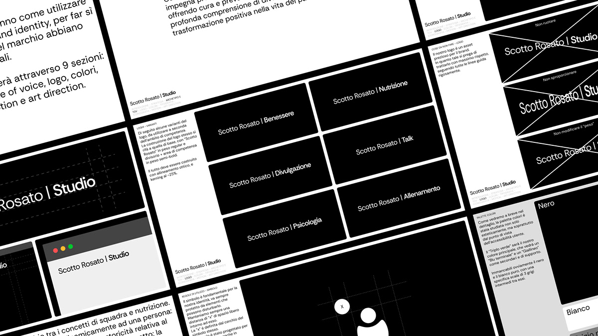
The logotype is dynamic and adaptable to the context of use; the basic version features the appendix "Studio" in semi-greed as opposed to "Scotto Rosato," the true focus of the brand. This will allow alternatives to the main logo to be created according to the context, as we will see below.
The symbol arises from the combination of the concepts of team and nutrition. From an analog scale we move dynamically to a person: the former precisely represents the passion and historicity related to the field of nutrition, which is and will remain pivotal to the project; the latter, on the other hand, represents the genesis of a person from a simple scale, person, people, professionals, who will be at the center of this new project.

Color palette
Colors reduced to the bone, in fact, totally absent. A grayscale that rather than aseptic wants to be minimal and functional. Scotto Rosato is a practice in continuous growth and metamorphosis, and the best way to accompany this concept is to take steps back from eccentricity to encourage adaptation to any medical-professional context.

Typeface
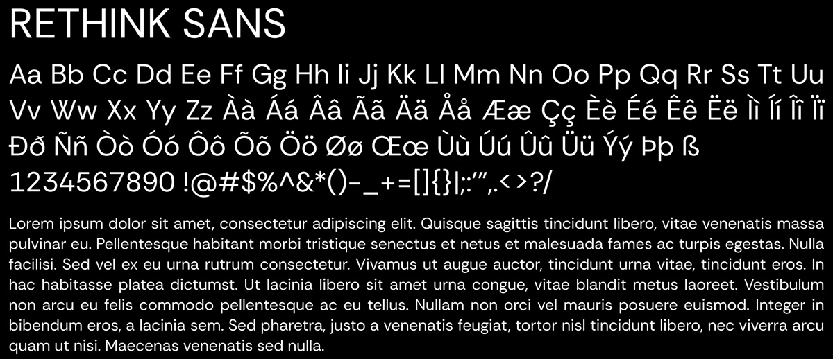
Again, just as with the palette, the choice could not fall for total cleanliness. Rethink Sans is a Google font with Grotesk strokes that is easy to read and has lots of character on some glyphs such as the lowercase "a" and "g."

Motion & icon
As mentioned earlier, figuratively the symbol represents an analog scale that becomes a person and vice versa. I thought the best method to represent this was in the form of an animation with these controlled speeds and a bit of exaggeration in the movements.


Thanks for watching!


